Dashboard
Dashboard walkthrough
A tour of the Dashboard — your home screen for the state of the business, rebuilt from your real jobs, punches and invoices every time you open it.
Dashboard is where CRMb opens. It pulls jobs, labor, cash and invoicing onto one screen so you can spot what needs attention — underbilled work, overtime risk, jobs losing margin — without digging through separate tabs. From here you can also open a full breakdown of your team's work, and change which tabs show up in your own sidebar.
This guide is the owner-and-manager Dashboard. An employee signing in gets a different screen — their day, their shifts, their tasks — so the tables and cards below aren't all there for everyone on your team.
Step 1 — The Dashboard at a glance
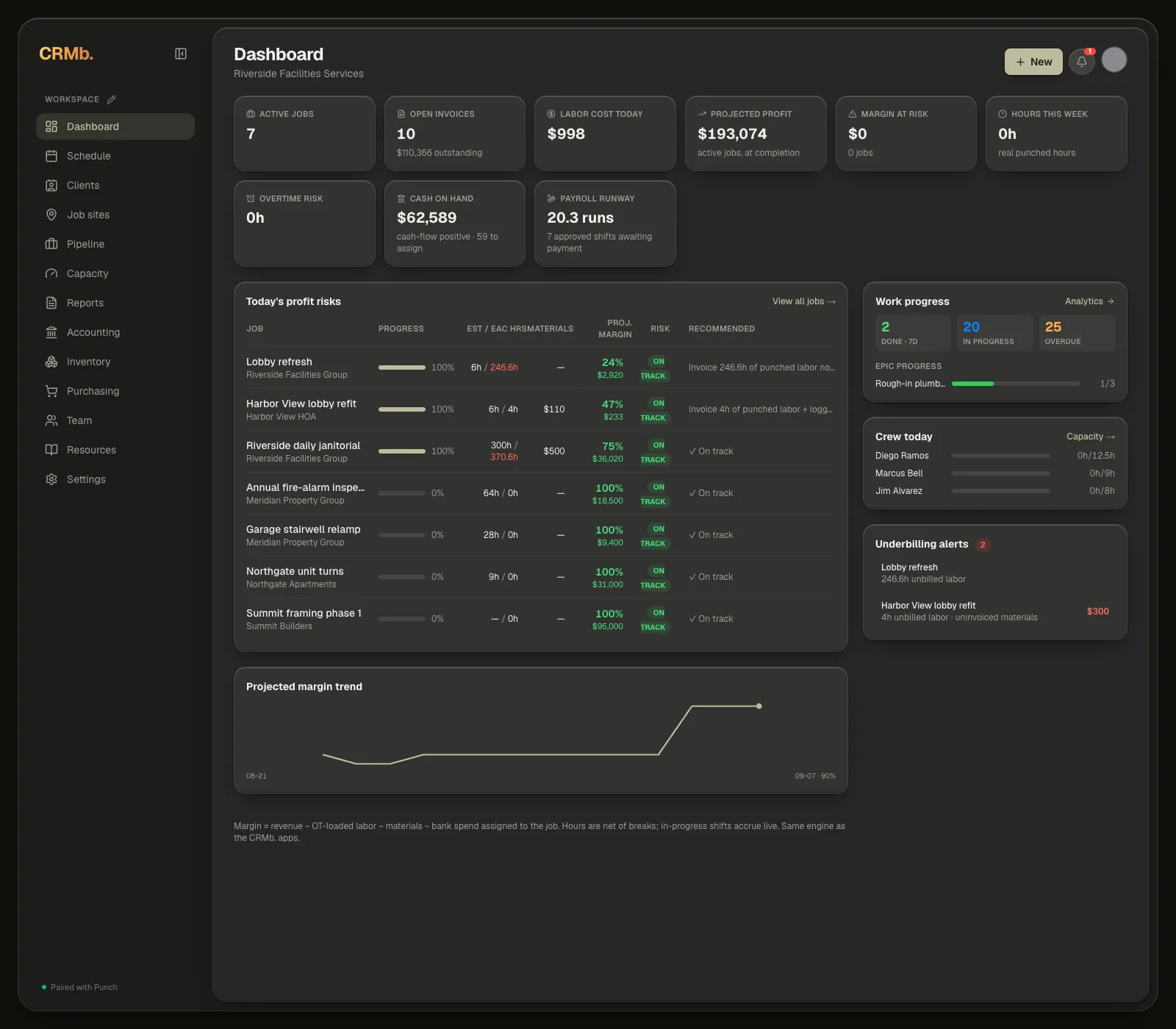
Across the top, a row of metric cards gives you the headline numbers. Below them, Today's profit risks lists your active jobs with their margin health, and the column on the right surfaces the job that needs you most, who's on the clock, and billing you're at risk of missing. Wherever you are on the Dashboard, the + New button at the top right starts a quote, invoice, purchase order, inventory item, job or task — no need to open another tab first.
Note — New inventory item and New purchase order belong to the Inventory add-on ($20 a month, which unlocks Inventory and Purchasing together). Without it, Purchasing asks you to turn the add-on on first.
Step 2 — Your key metrics
Across the top are seven metric cards. Two more — Cash on hand and Payroll runway — appear once you connect a bank, and Payroll runway waits until you've marked at least one payroll paid, so a brand-new workspace starts with seven.
They read left to right, in this order:
- Active jobs — how many jobs are in progress.
- Open invoices — how many invoices are still outstanding, with the amount owed underneath.
- Labor cost today — today's real punched labor cost, straight from Punch. It reads some crew unrated underneath when someone on today's shifts has no pay rate set.
- Projected profit — expected profit across your active jobs, at completion.
- Margin at risk — how much margin is at stake right now, and on how many jobs. Clicking it scrolls you down to Today's profit risks rather than opening a new page.
- Hours this week — real punched hours.
- Overtime risk — hours trending toward overtime this period.
- Cash on hand — the balance across the bank accounts you've selected, with a rough runway and how many bank charges are still waiting to be filed underneath.
- Payroll runway — how many payroll runs that cash covers, sized on your recent runs. When approved shifts are waiting to be paid, it says that instead.
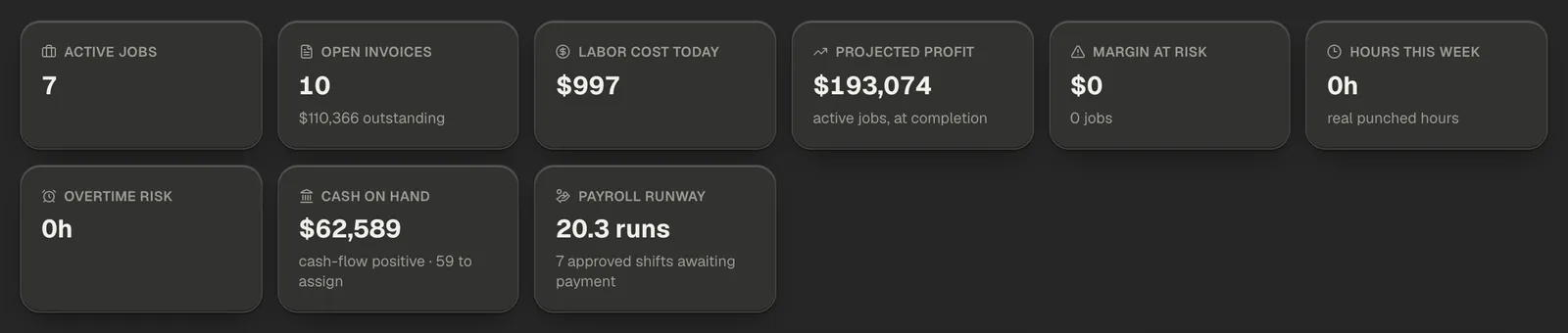
Note — A card draws a coloured border when it needs you. Margin at risk, Cash on hand and Payroll runway outline amber; Overtime risk outlines red. On a clean week none of them are outlined, so the borders you see depend on your own numbers.
Step 3 — Profit risks, crew, and underbilling
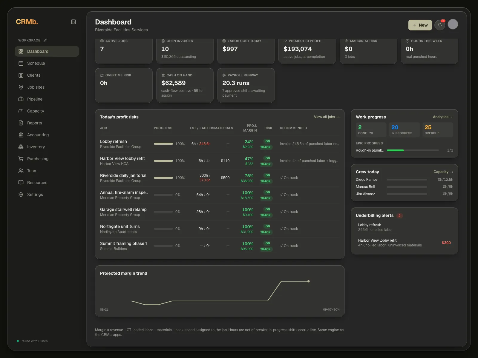
The profit-risks table lists each active job across seven columns — the job, its progress, estimated against forecast hours, materials, projected margin, a risk pill and the recommended next step. When any job is at risk, the heading carries a count beside it, and View all jobs sits at the right of that heading.
The column beside it keeps the rest of today in view without leaving the Dashboard:
- Priority alert — the single job costing you the most margin right now, with its quoted value, estimated against punched hours, remaining scheduled hours, materials, current and projected margin, a recommended next step, and two buttons: Open job and Adjust schedule. It only appears while at least one job is at risk.
- Work progress — three counts across the top (Done · 7d, In progress, Overdue) and up to three Epic progress bars beneath them. The whole card is a button; step 4 is what it opens.
- Crew today — who's scheduled today and how their punched hours compare to what was planned. It shows the eight people with the most hours booked; Capacity has the full list.
- Underbilling alerts — jobs with punched labor or logged materials that haven't been invoiced yet, so nothing falls through the cracks. It lists the top five, and the number in the badge is how many are shown.
- Projected margin trend — a rolling chart of your overall margin across active jobs. It needs two days of history before it draws a line, and says so until then.
Step 4 — Dig into Work analytics
Click the Work progress card to open Work analytics — a closer look at everything moving through your Pipeline board.
- Four counts across the top: how many tasks were completed and how many were created in the last 7 days, how many are due in the next 7 days, and how many are in progress as of today.
- Status overview — a donut of every task by status, with the counts listed beside it.
- Priority breakdown — every task on the board, by priority: Low, Medium, High and Urgent. This one counts all your tasks, not just the open ones.
- Types of work — how the board splits across Task, Story, Bug, Epic and Discovery.
- Team workload — each person's share of the open, not-yet-done tasks, with Unassigned in the same list.
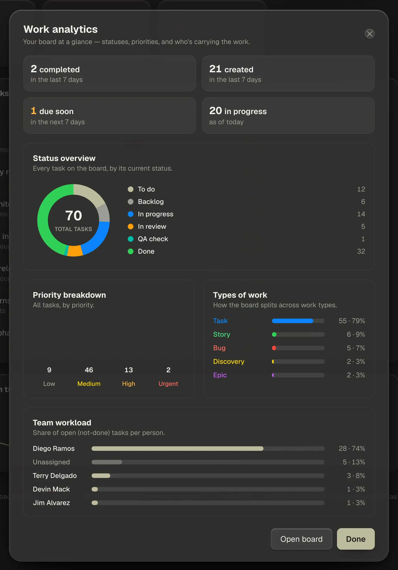
Note — The names and colours in Status overview are your own board columns, so if you've renamed or added columns on the Pipeline board they show up here exactly as you set them.
Note — The panel scrolls: Types of work and Team workload sit below the fold. At the bottom, Open board opens the Pipeline board and Done just closes the panel and leaves you on the Dashboard.
Step 5 — Edit which tabs show
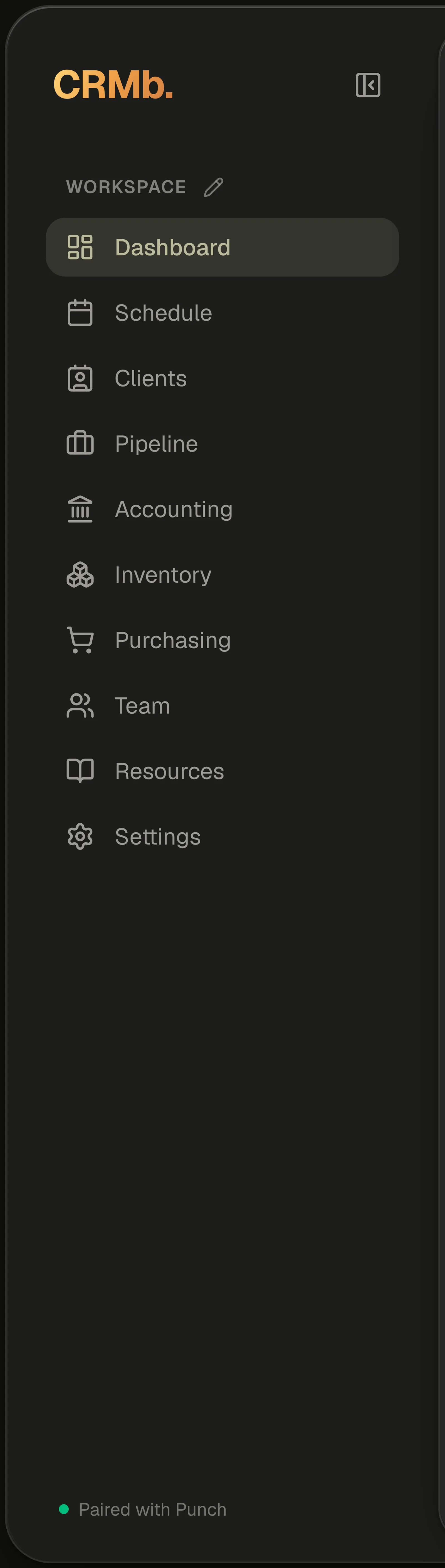
The sidebar isn't fixed. Next to the word Workspace, above the list of tabs, sits a small pencil — its tooltip reads Edit tabs. Click it and every tab you're allowed to move grows a drag handle on the left and an eye on the right. Dashboard and Settings get neither: they're marked Always, because you can't hide or move your home or your way out.
Drag a row to put the tabs in the order you want them. The new order saves the moment you let go.
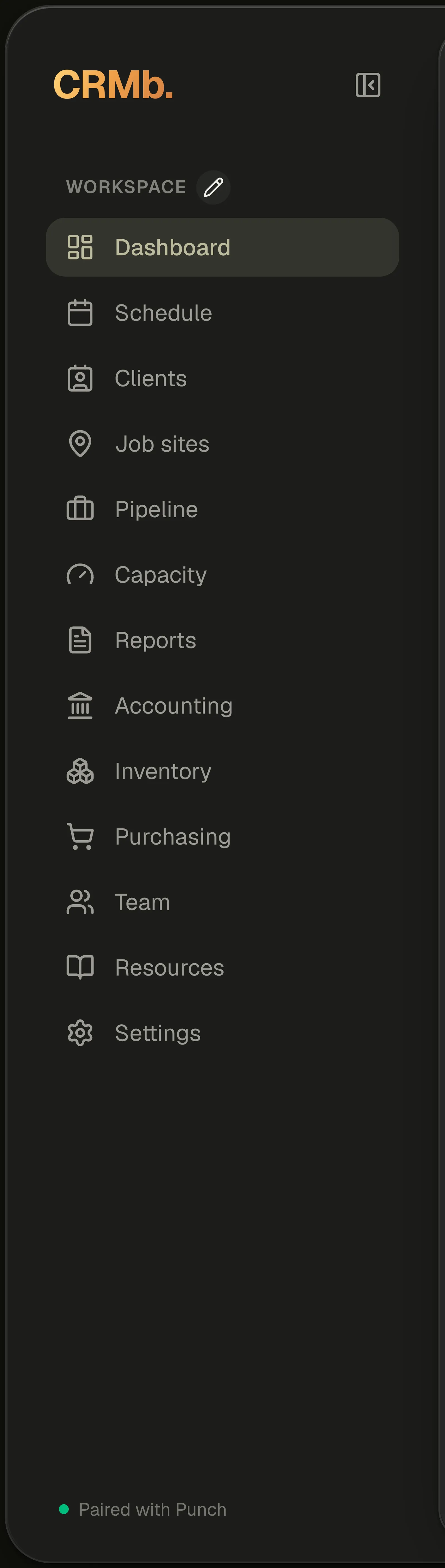
Note — Editing the tabs happens in the full sidebar on a desktop browser. On a narrow window the tabs open from the menu button instead, and there's nothing to edit there.
Step 6 — Hide what you don't need
Click the eye next to any tab to hide it. Here Job sites, Capacity and Reports have been switched off — they dim straight away but stay in the list while you're editing, so the same click brings one back. There's nothing to confirm: each click saves as you make it.
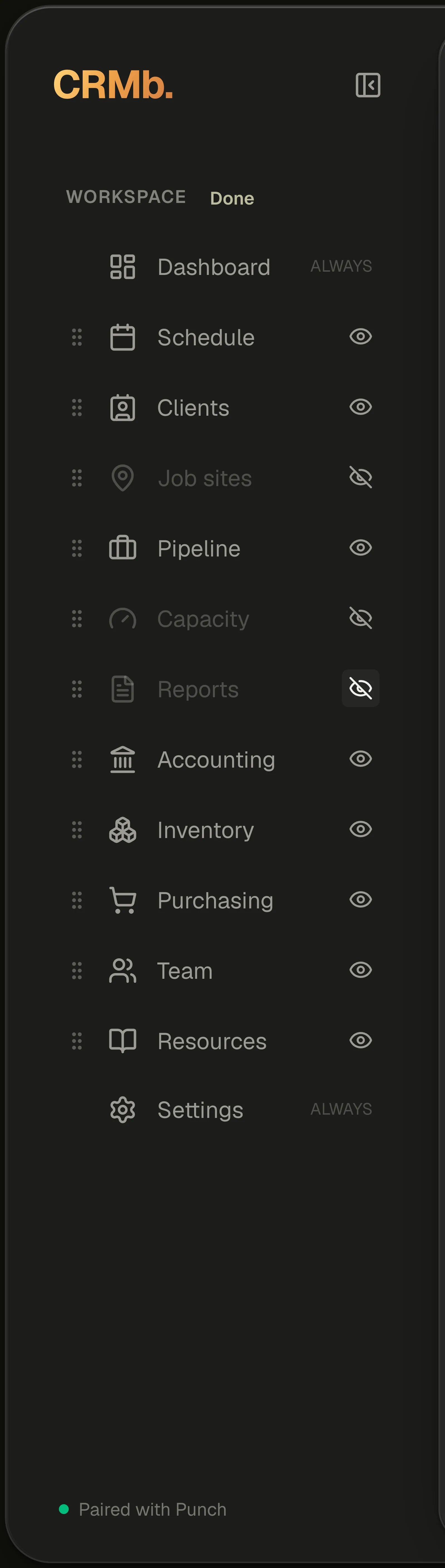
Note — Hiding a tab only changes your own view. Nothing about your data changes, nothing changes for your teammates, and a hidden section is still reachable from a link or a notification — you just don't have to look at it.
Step 7 — Finish, and collapse the rail
While you're editing, the pencil reads Done. Click it to leave edit mode and the sidebar settles into the shape you gave it — your changes were saved as you made them, so there's nothing left to commit.
Any time you want the space back, the button beside the CRMb wordmark collapses the whole sidebar down to icons; its tooltip reads Collapse to icons. Click it again to bring the labels back.